Look closer.
There's more underneath. Our name, our mark and our colours all came from somewhere, and none of it is by accident. This is the story behind them.
It started with a name.
AsterGaze had a name long before it had a brand. For a long time we were heads-down building for clients, and the way we looked never got the attention our work did.
When we finally sat down to give the company a look and a voice, we didn't start with a moodboard. We went back to the name and asked what it was really saying. It said more than we expected: who we are, how we work, and even where our colours come from.
Two words. One way of working.
Split AsterGaze in two and you get two ideas. Between them, they describe us better than any tagline we could have written.
Aster
From the asterisk. The mark that tells you there's more underneath.
Aster is Greek for star, and an asterisk is, quite literally, a little star.
Gaze
As in focus.
Looking at one thing long enough, and closely enough, to really see it.
Put together, the name describes how we work. We go deep instead of wide. We care about quality over quantity. We pick a thing, and we actually deliver it. Everything else in our brand comes out of those two words.
Our colours come from a flower.
Aster is also a flower, named for its star-shaped bloom. So we didn't pick a palette from a swatch book. We took it from the flower our name was already pointing at.

Aster Purple
Taken from the petals. Our lead colour. It carries the mark and every moment we want you to notice.
Terracotta
Taken from the centre. Warm and grounded. We use it with restraint, where something needs weight.
The triad
An orange and a green sit a third of the way round the colour wheel from our purple, completing a triad.
Look closely at the codes: it's the same three pairs of digits, rotated.
Ink
A warm dark, the base of every dark section.
Cream
A soft paper tone, the base of every light section.
What it looks like out there.
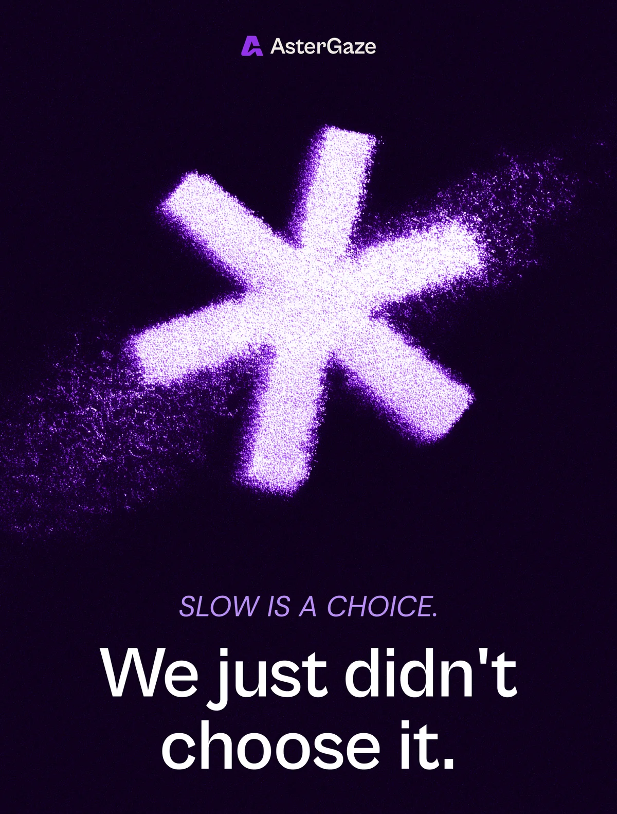
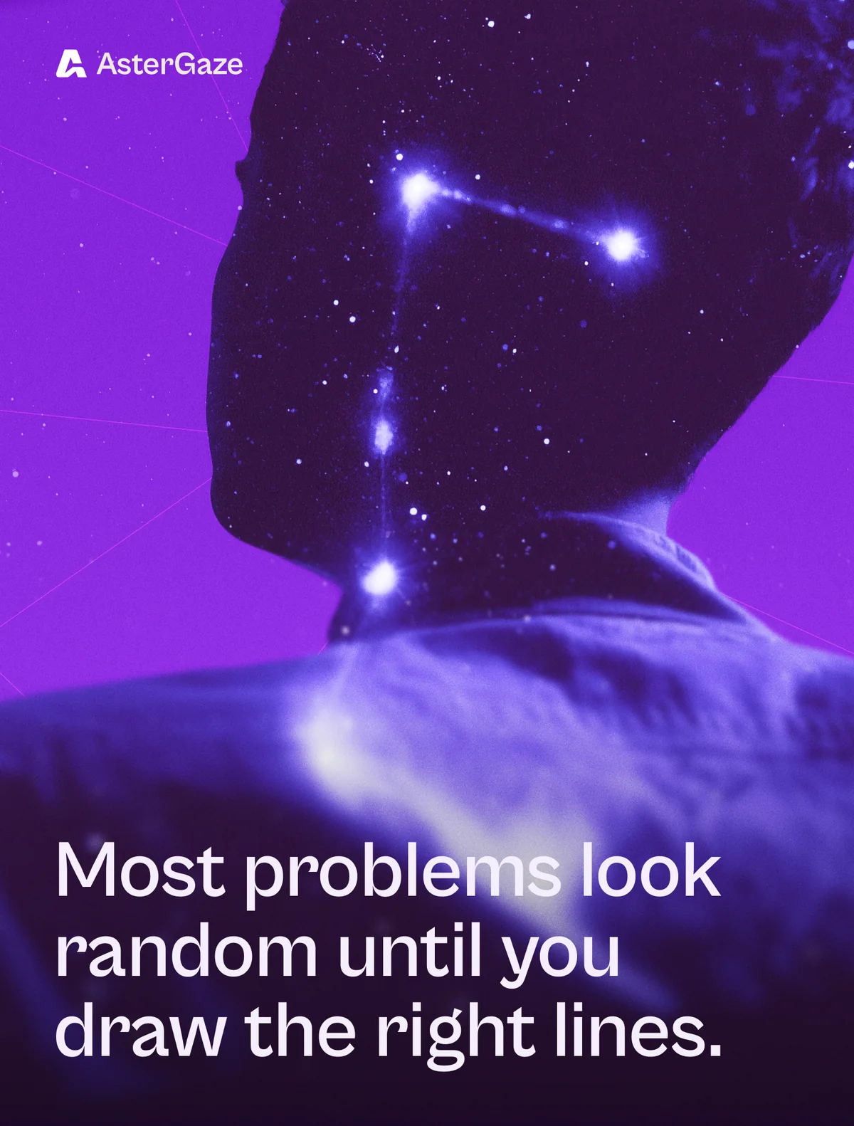
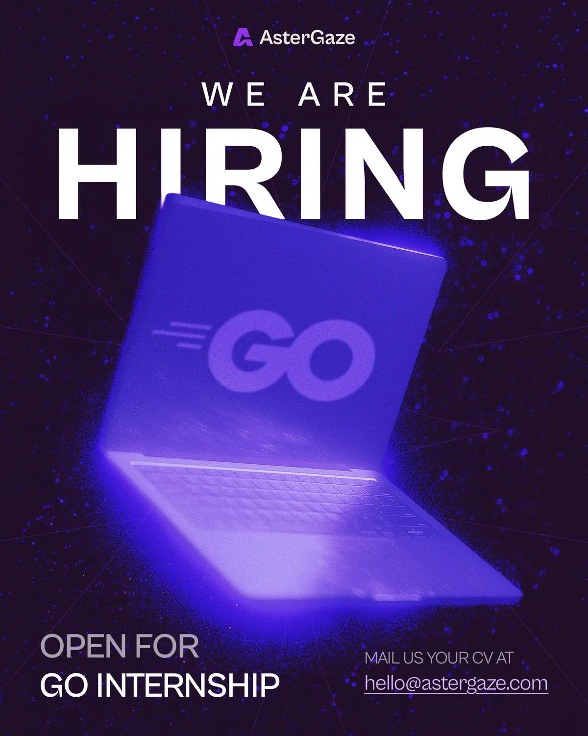
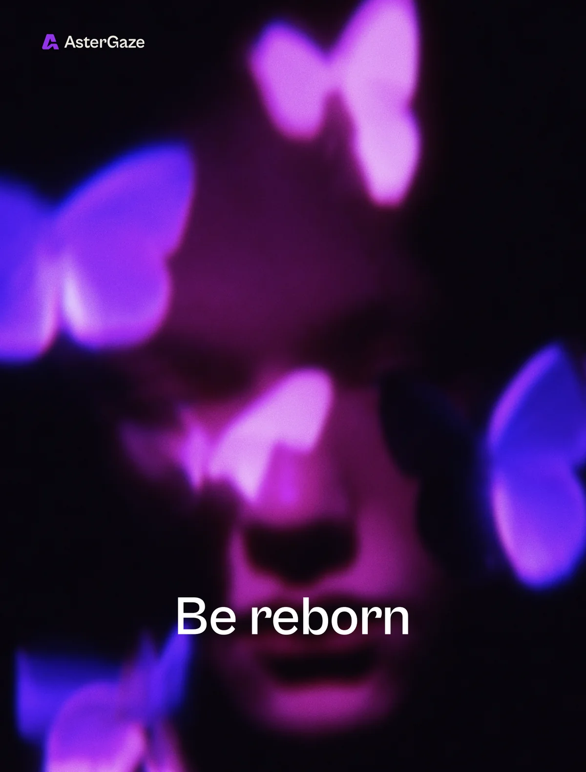
On social, our rule is simple: don't look like everyone else. Deep purples, starfields, a soft glow and some texture, with lines short enough to remember.





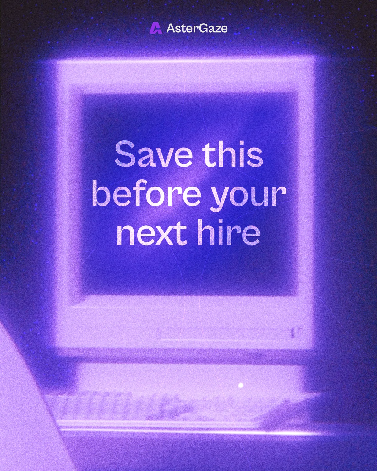
New products, same signature.
As AsterGaze grows into new products, we want every one of them to trace back to us. A logo can't stay the same across every product. A wordmark can. So they share the same type, the same cap height and the same left edge.
All except AceMyVisa. The idea behind it is different enough that we let it break the rule, on purpose.


Reach out
A product to build, a problem to solve, or a role to define.
We're open to all three.